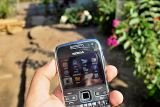
The Nokia E72 is no doubt a stunning device, it’s stylish, classy and thrives on the notion of difference and elitism yet conjuring. The phones built quality speaks so much of nobility; solid, sturdy and well built adhering stature and power. Design emanates sophistication and lauds seriousness making a bold statement that it can never go wrong.
The phone is framed into a desirable length of 144mm, a manageable width of 58mm and a pretty thin 10mm thickness, plethoric dimension for a feature pack device. It is a bit wider compared to say, N97 Mini, yet can be gripped close hand. The weight is slightly heavier than the norm, 128grams, a caveat that users need hurdle in exchange for a superb built quality. Screen size is about 2.36 inches with 320 by 240 pixels, just about the ideal, it might be smaller compared to Touchscreen devices but it shows more than enough for what it was designed for. Screens is rather well contrasted and gives a vivid color indoors and clear visibility outdoors especially in direct sunlight, a luxury that touchscreen phones like the N97 Mini and 5530 XM users cannot enjoy. The phone’s sides have less buttons than a regular N-Series phone, it has no camera button on the right side, and the topmost has only the 3.5mm jack and the power button, left side tacks in the USB charger port and memory card with cover. Less button on the sides equates classy (aura) but then again, mechanical music dedicated buttons would have been a welcome addition on the sides to control the music player without opening the screen, no problem with the headphone as it is supplied with controls but this became a problem with the use of stereo speakers. Maybe Nokia could integrate a long press mechanism to the volume keys to provide a shortcut for music control to prevent button addition.
The stereo speaker was cave in at the back of the phone, a minor offset in an almost perfect design, the sound doesn’t came out as loud as the norm since it can be obscured when the phone is place upside down or inserted on the phone cover provided. The surrounding metal edges and back cover helps create a solid touch illusion amidst its plastic frame, ingenious solution that can be considered an engineering marvel.
One touch key buttons where well placed and well spaced, it doesn’t feel or look cramp thus giving a refreshing impression. The metal surface covering the buttons add more to the illusion of toughness and class it portrays. The one touch buttons have two command fronts, short press and long press which the users can fully customize freely. Users can assign preferred application for these command prompts instead of the default. The Optical Navi Key on the DPAD is a welcome new addition to the device, it makes menu browsing savvy and interactive.
The phone has a 4 line QWERTY button that looks cramp giving a false impression of its usefulness but in reality, it isn’t hard to use at all, in fact it is the best QWERTY keyboard set up ever created for mobilephone. Unlike the full QWERTY slider phone were users have to exert effort to reach buttons in the middle, on this phone, every keyboard is within reached thus resulting to a faster typing speed. One hand used is even possible but needs time to get use to. One thing that’s not possible with this type of keyboard, typing with eyes closed, something that can be done with T9. The buttons were rather well marked and well lighted and has an excellent tactile feedback. Nokia uses a rubber mat for the phones keypad but it would have been better if they add a metal like surface texture to enhance the solid illusion more.
The phone has the highest capacity power source among Nokia devices, the BP-4L with 1500 mAh reserve that could last for more than 48 hours for regular users and as much as 32 hours for tech freaks that includes countless hours of browsing, half day of music, unaccounted calls and SMS, snapshots, games etc. (Click Here for the Battery Test article) It is no less than the best battery performing device yet by far among Nokia phones.
The camera lens was left unprotected, a bit of a disappointment for photo enthusiast since it’s a rib to their interest, Nokia must have put something to cover this precious feature. The phone has no camera button and utilizes the DPAD for such, a more appropriate set up since users cannot use the phone in landscape. Welcome addition to the camera set up was the Optical Navi key mechanism which activates autofocus automatically by simply touching the pad, it totally eliminates the half press autofocus mechanism of most Nokia phones. Pressing it will capture the image, best set up by far.
A very good hardware impression overall and verging in line among the best but the biggest achievement that Nokia made for the E72 was its ability to topped the legendary E71 making it a real upgrade unlike the N-Series lines where succession was not achieve well (N95-N96, N96-N97, N82-N86). Software review follows, stay tuned!
0 comments:
Post a Comment